Color Perception in Fashion: Mood, Message, Context
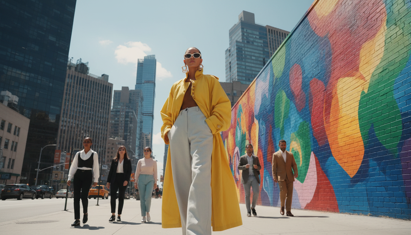
Color Perception in Fashion: A Practical System for Mood, Message, and Style
Color choices in clothing influence how a look feels internally and how it reads to others—often before a single word is spoken. A reliable way to use color is to treat it like a three-part system: mood (how it affects you), message (how it’s commonly read), and context (what changes the effect). With a few repeatable rules, outfits can feel intentional and consistent without becoming rigid.
A simple color-perception system: mood, message, and context
Mood is the internal side of color: some palettes feel energizing, others feel steadying, and some make it easier to concentrate. While color isn’t a magic switch, it can act like a subtle “setting” for the day.
Message is the social side: color helps communicate confidence, approachability, creativity, authority, or ease. These reads aren’t universal, but they’re common enough to be useful when you want your outfit to land a certain way.
Context is what keeps the system practical. Lighting, fabric sheen, texture, fit, and nearby colors can all change what the same hue conveys—especially on camera.
The goal is consistency over perfection. A small set of personal color rules reduces decision fatigue and helps outfits feel more “you,” even when the schedule changes quickly.
How clothing color affects mindset (without turning it into a rulebook)
Color can nudge arousal and comfort. Brighter, clearer colors often feel more activating, while muted or deeper palettes often feel grounding. Research on color perception suggests color can influence psychological functioning in measurable ways, though results vary by task and context (American Psychological Association).
Association effects matter just as much as general “rules.” A shade that signals confidence to one person may feel tense to someone else because of memories, uniforms, or cultural meaning. Treat general guidance as a starting point, then adjust for personal response.
Stable “go-to” colors can also support self-concept and reduce morning stress. When a few trusted colors reliably help you feel sharp or calm, getting dressed becomes less of a negotiation and more of a quick decision. Clothing itself can influence cognitive processes through what researchers call enclothed cognition (Journal of Experimental Social Psychology).
Two-week exercise: choose one anchor color for calm, one for energy, and one for confidence. Build most outfits around those anchors for 14 days and note patterns: which days felt easier, which photos looked best, and which combinations you repeated naturally.
Quick mood mapping for outfit planning
| Goal | Color direction | Best use cases | Easy pairing |
|---|---|---|---|
| Calm & grounded | Deep neutrals, cool blues, soft greens | Travel days, long meetings, recovery days | Off-white, charcoal, denim |
| Energy & momentum | Warm reds, clear brights, high-saturation accents | Presentations, social plans, creative sprints | Navy, black, crisp white |
| Focus & clarity | Mid-tone blues, clean monochromes, low-contrast sets | Study, deep work, interviews | Grey, tan, tonal layering |
| Approachable & friendly | Warm neutrals, peachy tones, soft pastels | Networking, client-facing days, casual dates | Cream, light denim, cocoa brown |
How color shapes perception in fashion: the social “read” of an outfit
When an outfit “reads” a certain way, it’s usually not just the hue—it’s the combination of contrast, value, and saturation.
Contrast signals intensity. High-contrast outfits (black/white, navy/white, sharp color-blocking) can feel bold and directive. Low-contrast outfits (tonal creams, soft monochromes, close-value pairings) often read calm, refined, and less forceful.
Value affects authority. Darker values tend to look more formal and controlled; lighter values tend to appear more open and casual. If you want authority without feeling severe, use a dark base with a softer light element near the face.
The psychology of color in clothing: what changes the effect
Personal contrast: skin, hair, and eye contrast changes harmony. Higher-contrast coloring often supports clearer contrast in outfits; lower-contrast coloring may look best with softer transitions. For deeper dives into color systems and palettes, the Pantone Color Institute is a useful reference point for how hue families and undertones are categorized.
A repeatable method for building outfits by purpose
Common color pitfalls and how to fix them fast
Digital tools to make color decisions faster
If you want a structured, repeatable way to choose colors based on mood goals and the impression an outfit creates, the Color Perception System in Fashion – 3-in-1 Bundle (Digital Guides) organizes color psychology into practical wardrobe formulas for workwear, events, capsule building, and photo consistency.
For days when context matters most—travel, mixed climates, unpredictable schedules—pairing a stable color system with a streamlined packing approach can be helpful. One Bag, Two Weeks, Zero Stress – How to Pack a Carry On for Two Weeks supports simpler outfit planning so your “anchor colors” stay consistent even on the move.
Seasonal shifts also change how color reads on skin; winter dryness and redness can make certain tones feel harsher. If you notice your usual shades suddenly feel “off” in cold weather, Winter Survival Skincare Tips Bundle can support a more even base so your wardrobe colors look closer to how you intended.
FAQ
Does wearing certain colors actually change mood?
Color can nudge mood and confidence, but the effect depends heavily on personal associations, culture, and situation. Tracking how you feel in a few repeat palettes over time is more reliable than following rigid rules.
What color should be worn for a professional, confident impression?
Darker neutrals like navy, charcoal, and deep blue-green tend to read confident and polished, especially with clean lines and good fit. Keep contrast controlled and add one restrained accent if you want to look more approachable.
How can bright colors be worn without feeling overwhelming?
Use one bright piece and keep the rest neutral or tonal, or choose a more muted version of the same hue. Matte textures and placing the bright farther from the face can also make the look feel more balanced.








Leave a comment